
2024
Terraco
UX/UI
Branding
At a Glance
This case study explores the development and iteration process of Terraco’s application featuring user research, heuristic evaluation and key features. The information has been succinctly presented through the use of diagrams, site maps and user task flows.
Background
This application was designed as part of a collective group university project which required us to come up with packaging solutions that reinforced the circularity of design.The group consisted of another UX/UI designer in charge of designing the website, a graphic designer and a branding manager. Along with my peers, we decided on creating a sustainable packaging company/organisation that is dedicated to offering people and businesses that we partner up with- environmentally responsible packaging solutions.
I was in charge of creating an application that aims to successfully put the return incentive into actionable steps by allowing users to return their used packaging back to us in exchange for gift cards. By focusing on a minimalist design approach I was successfully able to highlight the key features of the application allowing for a most straightforward user experience.

Information
Setting the Foundation
Over 12 weeks, I independently designed the UX/UI for this application — translating research insights into thoughtful, user-centred interface decisions.
Timeline: 12 weeks (12th February - 29th April)
My Role: UX/UI designer for the application
Collaboration: Individual sub-project
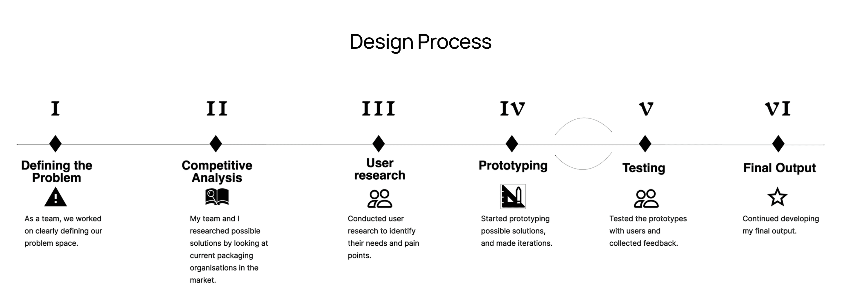
Process
As I independently led the design of the entire application, I structured my process into clear, strategic phases: problem definition, competitive analysis, user research, persona development, prototyping, usability testing, and iterative refinement.
To ground the project in industry context, I analysed organisations such as APCO and The Packaging People to understand their brand positioning, sustainability strategies, and market approach. While these organisations prioritise biodegradable and recyclable packaging solutions, I identified a key gap, none had introduced a return-based incentive system that actively engages the community in circular participation.
This insight informed the creation of a primary user persona, allowing me to design with a clearly defined user need in mind: motivating everyday consumers to participate in sustainable return behaviours through tangible incentives and seamless digital interaction.
Goals
From the user testing, pain points and needs were taken and the main goals of the application were addressed.
To create an minimal and straightforward layout so that the user can return their packaging without getting confused between the different elements of the application.
To create a feature that allows the user to get something in return.
To create a smooth-flowing user flow for a positive experience
To add the essence of Terraco’s branding using consistent features offering the user a sense of familiarity.
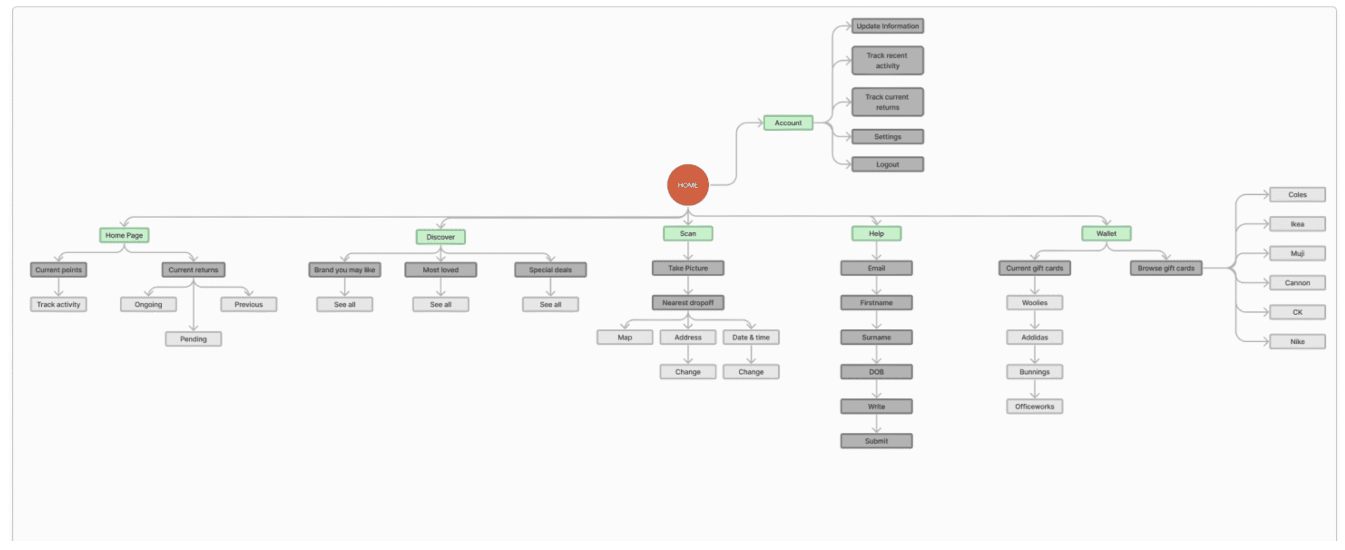
A site map was carefully designed to adhere to all the goals.
A site map was carefully designed to adhere to all the goals.
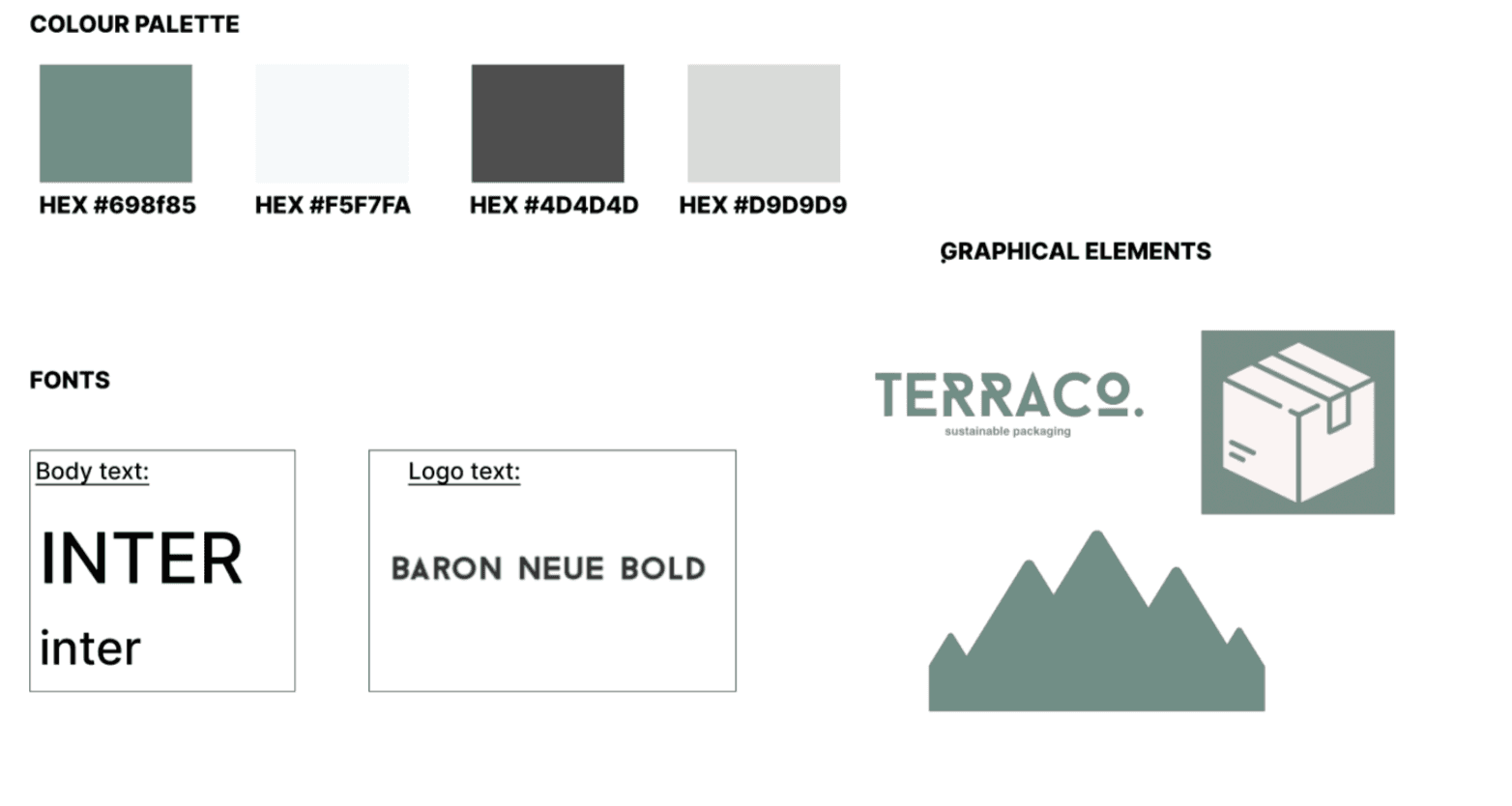
Prototyping
BRANDING: I used the branding guidelines my branding manager created for us. However, after discussion with my team members regarding a user-friendly colour palette, I ended up altering it a bit.
Prototyping
BRANDING: I used the branding guidelines my branding manager created for us. However, after discussion with my team members regarding a user-friendly colour palette, I ended up altering it a bit.
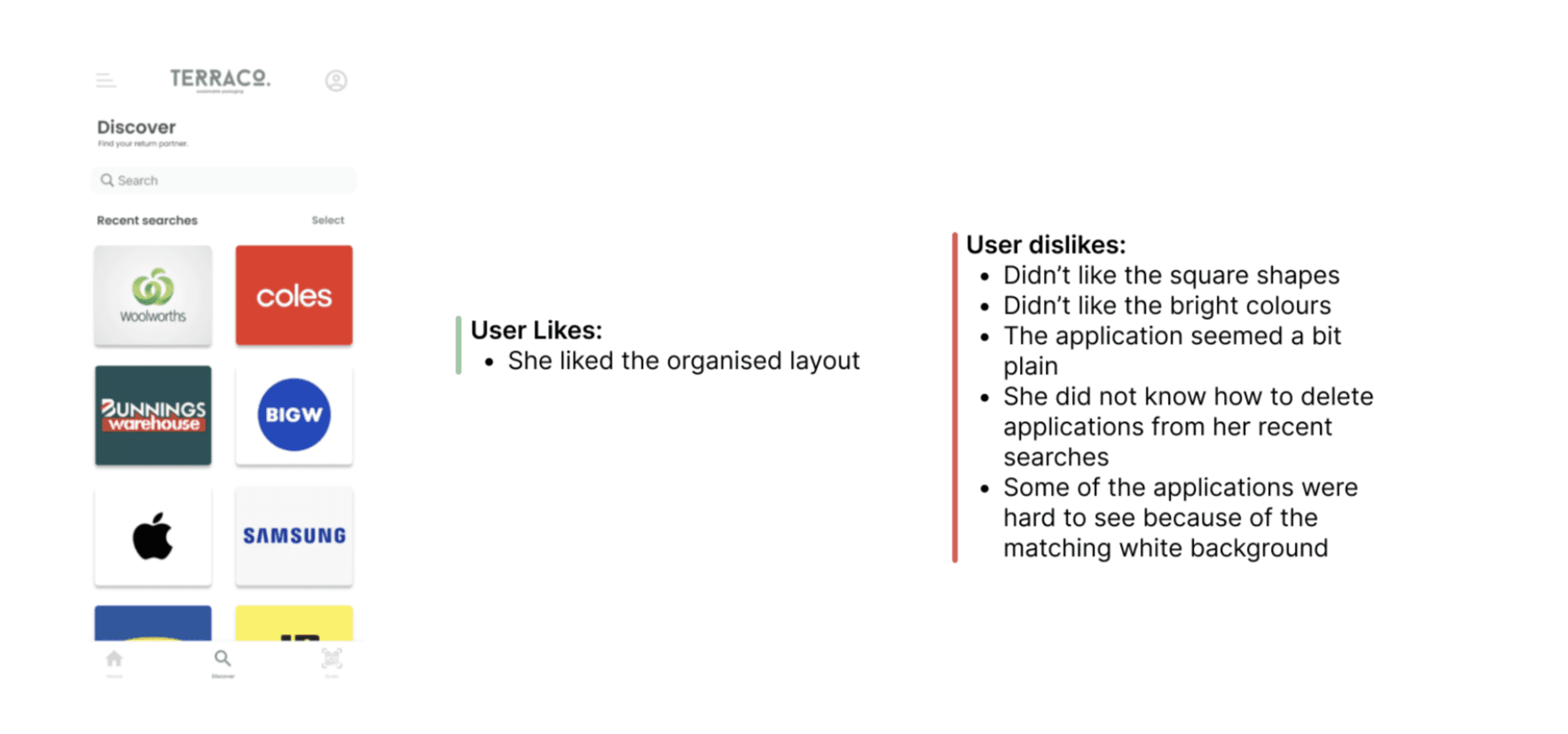
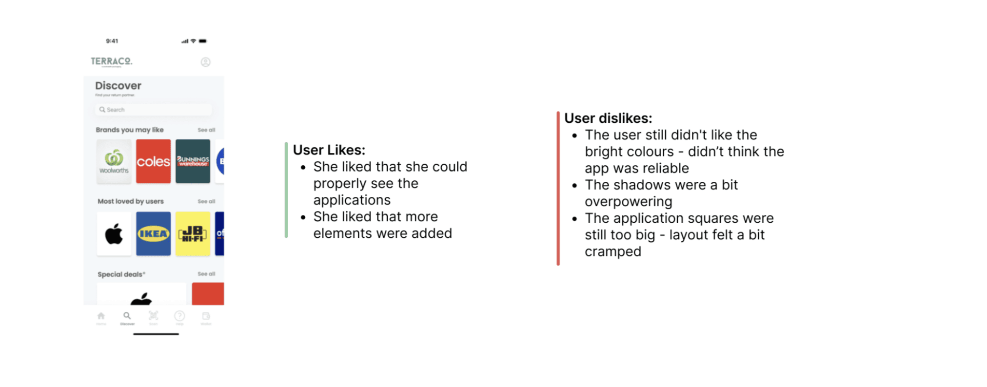
Iterating
Through multiple rounds of usability testing and feedback, I iterated on my designs to improve clarity, reduce friction, and better align the interface with user behaviours and expectations.
Iterating
Through multiple rounds of usability testing and feedback, I iterated on my designs to improve clarity, reduce friction, and better align the interface with user behaviours and expectations.
Low Fidelity
Low Fidelity
Medium Fidelity
Medium Fidelity
High Fidelity
High Fidelity
Key Features


More Works
(SL® — 02)
©2024


FAQ
01
What does a project look like?
03
Are all projects fixed scope?
05
How do I measure success?
06
What do I need to get started?
2024
Terraco
UX/UI
Branding
At a Glance
This case study explores the development and iteration process of Terraco’s application featuring user research, heuristic evaluation and key features. The information has been succinctly presented through the use of diagrams, site maps and user task flows.
Background
This application was designed as part of a collective group university project which required us to come up with packaging solutions that reinforced the circularity of design.The group consisted of another UX/UI designer in charge of designing the website, a graphic designer and a branding manager. Along with my peers, we decided on creating a sustainable packaging company/organisation that is dedicated to offering people and businesses that we partner up with- environmentally responsible packaging solutions.
I was in charge of creating an application that aims to successfully put the return incentive into actionable steps by allowing users to return their used packaging back to us in exchange for gift cards. By focusing on a minimalist design approach I was successfully able to highlight the key features of the application allowing for a most straightforward user experience.
Information
Setting the Foundation
Over 12 weeks, I independently designed the UX/UI for this application — translating research insights into thoughtful, user-centred interface decisions.
Timeline: 12 weeks (12th February - 29th April)
My Role: UX/UI designer for the application
Collaboration: Individual sub-project
Process
As I independently led the design of the entire application, I structured my process into clear, strategic phases: problem definition, competitive analysis, user research, persona development, prototyping, usability testing, and iterative refinement.
To ground the project in industry context, I analysed organisations such as APCO and The Packaging People to understand their brand positioning, sustainability strategies, and market approach. While these organisations prioritise biodegradable and recyclable packaging solutions, I identified a key gap, none had introduced a return-based incentive system that actively engages the community in circular participation.
This insight informed the creation of a primary user persona, allowing me to design with a clearly defined user need in mind: motivating everyday consumers to participate in sustainable return behaviours through tangible incentives and seamless digital interaction.
Goals
From the user testing, pain points and needs were taken and the main goals of the application were addressed.
To create an minimal and straightforward layout so that the user can return their packaging without getting confused between the different elements of the application.
To create a feature that allows the user to get something in return.
To create a smooth-flowing user flow for a positive experience
To add the essence of Terraco’s branding using consistent features offering the user a sense of familiarity.
A site map was carefully designed to adhere to all the goals.
Prototyping
BRANDING: I used the branding guidelines my branding manager created for us. However, after discussion with my team members regarding a user-friendly colour palette, I ended up altering it a bit.
Iterating
Through multiple rounds of usability testing and feedback, I iterated on my designs to improve clarity, reduce friction, and better align the interface with user behaviours and expectations.
Low Fidelity
Medium Fidelity
High Fidelity
Key Features
More Works
(SL® — 02)
©2024
FAQ
01
What does a project look like?
03
Are all projects fixed scope?
05
How do I measure success?
06
What do I need to get started?
2024
Terraco
UX/UI
Branding
At a Glance
This case study explores the development and iteration process of Terraco’s application featuring user research, heuristic evaluation and key features. The information has been succinctly presented through the use of diagrams, site maps and user task flows.
Background
This application was designed as part of a collective group university project which required us to come up with packaging solutions that reinforced the circularity of design.The group consisted of another UX/UI designer in charge of designing the website, a graphic designer and a branding manager. Along with my peers, we decided on creating a sustainable packaging company/organisation that is dedicated to offering people and businesses that we partner up with- environmentally responsible packaging solutions.
I was in charge of creating an application that aims to successfully put the return incentive into actionable steps by allowing users to return their used packaging back to us in exchange for gift cards. By focusing on a minimalist design approach I was successfully able to highlight the key features of the application allowing for a most straightforward user experience.
Information
Setting the Foundation
Over 12 weeks, I independently designed the UX/UI for this application — translating research insights into thoughtful, user-centred interface decisions.
Timeline: 12 weeks (12th February - 29th April)
My Role: UX/UI designer for the application
Collaboration: Individual sub-project
Process
As I independently led the design of the entire application, I structured my process into clear, strategic phases: problem definition, competitive analysis, user research, persona development, prototyping, usability testing, and iterative refinement.
To ground the project in industry context, I analysed organisations such as APCO and The Packaging People to understand their brand positioning, sustainability strategies, and market approach. While these organisations prioritise biodegradable and recyclable packaging solutions, I identified a key gap, none had introduced a return-based incentive system that actively engages the community in circular participation.
This insight informed the creation of a primary user persona, allowing me to design with a clearly defined user need in mind: motivating everyday consumers to participate in sustainable return behaviours through tangible incentives and seamless digital interaction.
Goals
From the user testing, pain points and needs were taken and the main goals of the application were addressed.
To create an minimal and straightforward layout so that the user can return their packaging without getting confused between the different elements of the application.
To create a feature that allows the user to get something in return.
To create a smooth-flowing user flow for a positive experience
To add the essence of Terraco’s branding using consistent features offering the user a sense of familiarity.
A site map was carefully designed to adhere to all the goals.
Prototyping
BRANDING: I used the branding guidelines my branding manager created for us. However, after discussion with my team members regarding a user-friendly colour palette, I ended up altering it a bit.
Iterating
Through multiple rounds of usability testing and feedback, I iterated on my designs to improve clarity, reduce friction, and better align the interface with user behaviours and expectations.
Low Fidelity
Medium Fidelity
High Fidelity
Key Features
More Works
©2024
FAQ
What does a project look like?
Are all projects fixed scope?
How do I measure success?
What do I need to get started?